Wireframes and models illustrating the user interface of the website:
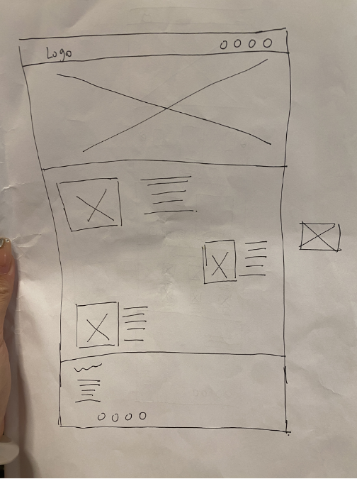
After gaining a deeper understanding of the basic design and components of the FreedomFest website, I created some wireframes and mockups to illustrate the website’s user interface, which I believe represent the basic design layout of the product. The wireframes carry the key information of the interface display, drawing the shape of the application or website interface to be developed, and the main purpose is to present the most basic but important information of the product design, which should be simple and effective.This is a wireframe sketch I created for the web and application design can not guarantee that I will end up in the user interface in the design of this layout, but this is how I layout ideas, using the column grid can make the effect neat and simple, and then I left and right left and right sequences for the text picture layout, I think that this symmetrical layout can be given to the people looking at the simple intuitive and comfortable on the visual experience not so much fancy and through the found that now many websites have not like the design is too complex, and the user can quickly find information to provide users with convenient
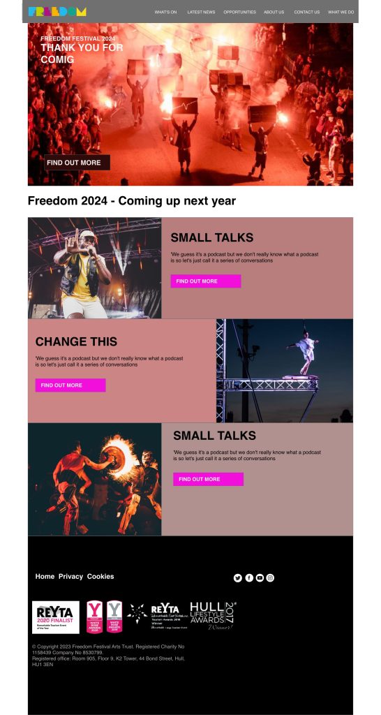
This is the model of the web page I designed, and the wireframe than I added pictures and colour scheme, but not yet designed the micro-label, I think the base colour is white is better, because it is brighter and cleaner, with a picture of the Freedom Festival, I think the red is more bright and is the typical symbol of the Freedom Festival picture, but this is not what I want to put in the end, I want to put the Freedom Festival video because I think that the video material will be added to the web page design, can enrich the whole web page presentation form, can further attract the user’s attention, relatively speaking, the video will have a better effect of conveying information video than pictures can hold more information. Web page design, can enrich the whole web page presentation form, can further attract the attention of users, relatively speaking, the effect of the information conveyed by the video will be better video than pictures can carry more information, in the web page of the reasonable introduction of the video can be effective in attracting the attention of users. Imported video can better convey emotions, more expressive, can let the user more easily “feel” the information you want to convey. It is more attractive than a pure image, and then I use different colours to differentiate the overall structure.
实施响应式设计
You first need to define the basic structure of a web page using an elastic grid layout. By dividing the page into columns and rows and defining their widths and heights using percentage units, it is possible to make the page elements automatically adapt to different screen sizes. Use media queries to apply different style rules based on different screen widths. By setting different CSS styles, you can adjust font sizes, image sizes, layout structure, etc. to suit the display needs of different devices. I think I managed to achieve the principle of responsiveness .
Cross-device compatibility
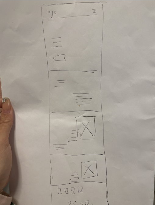
Compatible with multiple devices is the problem of mutual adaptation between devices and devices, and devices and multiple devices to match between the appropriate, and can work properly and applications, each other normal operation, build this web model after I built the iPhone version of the web interface, I through the principle of responsive so that the computer and mobile phone interface to match, and then I use the F-type layout it’s based on the basic principles of how people’s The basic principle is based on the order of how the human eye moves across a page, i.e. how people scan content. An F layout has content that stands out across the top of the page, with secondary content aligned underneath it on the left-hand side of the page (in a rough “F” shape). It is also a very clean page.
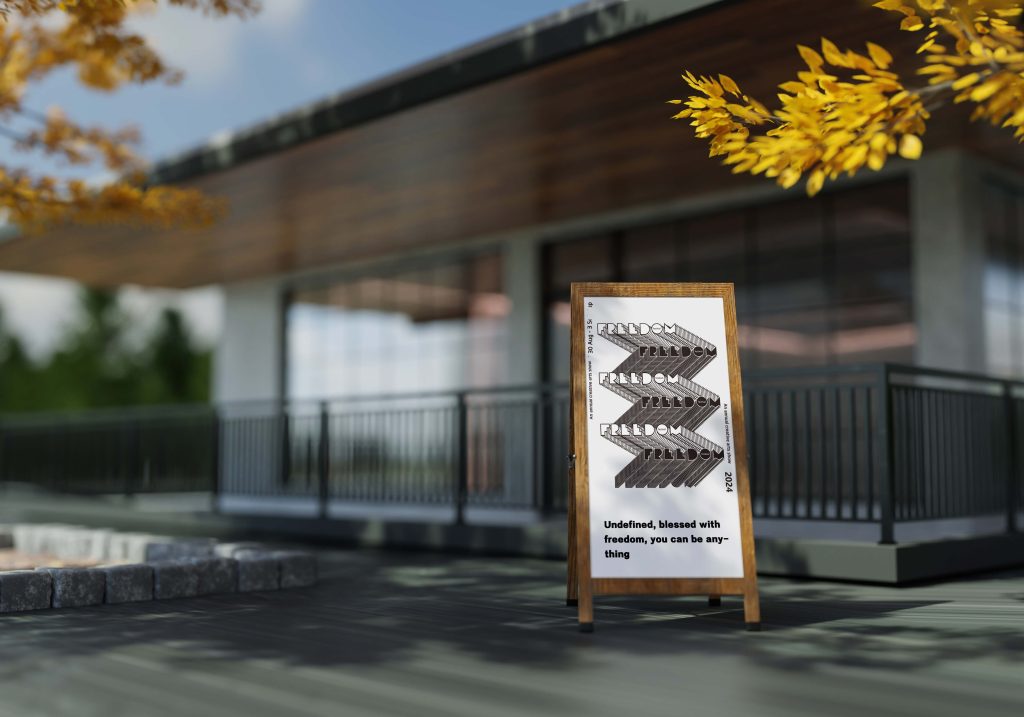
This one is in the form of a font overlay, I adjusted it based on factors such as font and font size to ensure readability and clarity of the text, then the colour and contrast of the overlapping text also needs to be considered, if the colours are too similar the text becomes indistinguishable so I chose high contrast colours to ensure clarity and readability of the typeface, and then the font choice is also an important issue in overlapping text that I designed an overlay with the official logo first, I think this adds visual hierarchy and is more interesting then I also designed a poster with this, by folding the overlay, I think this makes it memorable and the black and white is more eye-catching with the date and year around it, I think this could be placed on billboards or social media or in the form of a leaflet.
 This one is designed by stretching and compressing the top and bottom, the top layer is white and the bottom is a jumping off colour to create a stark contrast, which I think is more fun!
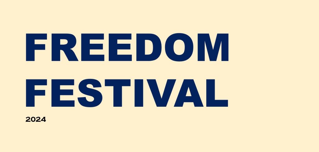
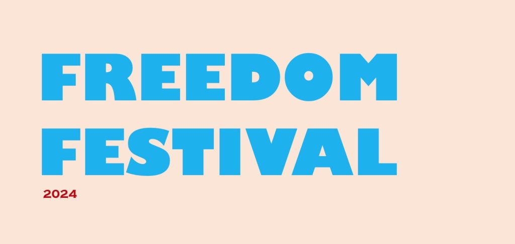
This is my design through the different background colours and like the font colour, with low saturated colours of yellow and light pink as a background plus bright colours dark blue fonts with this is more formal and minimalist, but some monotonous!
Brand design
1.target audience, the brand’s reputation and the brand’s unique selling points, and make sure that they are aligned with the company’s core values.
2.Create a brand identity and brand imDetermine brand positioning and target audience:It is critical to the success of a brand to first define its positioning and who its target audience is. Determine the brand’s age: A good brand identity and image can help people remember the brand. A brand identity should be simple, unique and easy to recognise. Brand image includes colours, fonts, icons, logos and slogans, etc. Brand communication: through visual, audio, verbal and other means of communication, the brand will be conveyed to users.
3.Developing a brand strategy:Developing a successful brand strategy requires consideration of the market, competitors and target customers. The brand strategy should include the brand’s objectives, positioning, pricing, promotion and distribution channels.
4. Building brand reputation:Building a good brand reputation requires sustained investment. Providing high quality products and services, offering customer satisfaction guarantees and customer service, earning word-of-mouth, promoting through social media, sponsoring events and attending industry events.
5. Maintaining brand image: Maintaining brand image requires the establishment of a useful brand reputation management programme. This programme should include monitoring the public image of the brand, dealing with bad information and building brand trust.
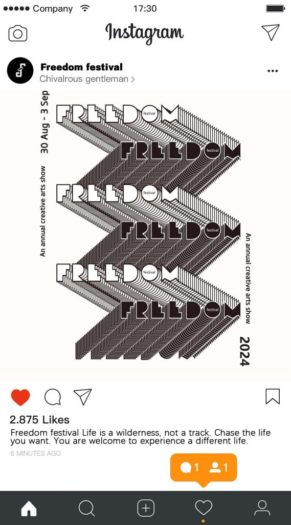
Here are some diagrams of the Freedom Festival brand identity I made, like I said marketing the Freedom Festival through billboards and posters social platforms visual marketing strategies I created the City of Hull’s poster branding, my poster design was designed in the form of a black and white text overlay design the tagline I was thinking of was not to be defined, celebrate the freedom to be whatever you want to be, to grab people’s attention because the Freedom Festival itself is about freedom, and So I suddenly thought ‘we had so much desire for the waves of destiny, to the end only to find that the most beautiful scenery of life, but the inner calm and relaxed, I had so much expectation of external recognition, to the end only to know that the world is their own, and has nothing to do with others, no matter what kind of life you live into there will be people talking about it, the world we only come once, you do not necessarily have to be You don’t have to be a rose, if you’re happy, you can be a weed. People are born free, but they are always in chains. So I think we should be undefined, we should embrace freedom, and I think that should resonate with more people, attract a large number of people who aspire to freedom to come to the festival, feel free and happy, and give a good sense of experience. Then this is the instagram post that I created for my microfreedom festival, as an interaction design to let users experience the interactive feeling, they can visualise when and what the event is about I also came up with a theme to welcome people and generate interaction with the users, to better incorporate the hobbies of contemporary young people who like to swipe on social media software.
Moving image
I’m going to do a few seconds of video animation to promote the Freedom Festival and use microtags to create a creative video