In my opinion, the current design of Freedom Festival is not very interactive. As a national festival, Freedom Festival has a high offline participation rate, but in my opinion, the webpage design does not allow people to participate online well. Especially for young people nowadays, they have various channels to obtain information, and need sustainability, diversity and fun. Since the last brand design, perhaps people have aesthetic fatigue. I will design an innovative design to give people a new visual impact
Content
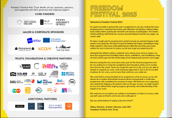
The 2023 Freedom Festival presentation
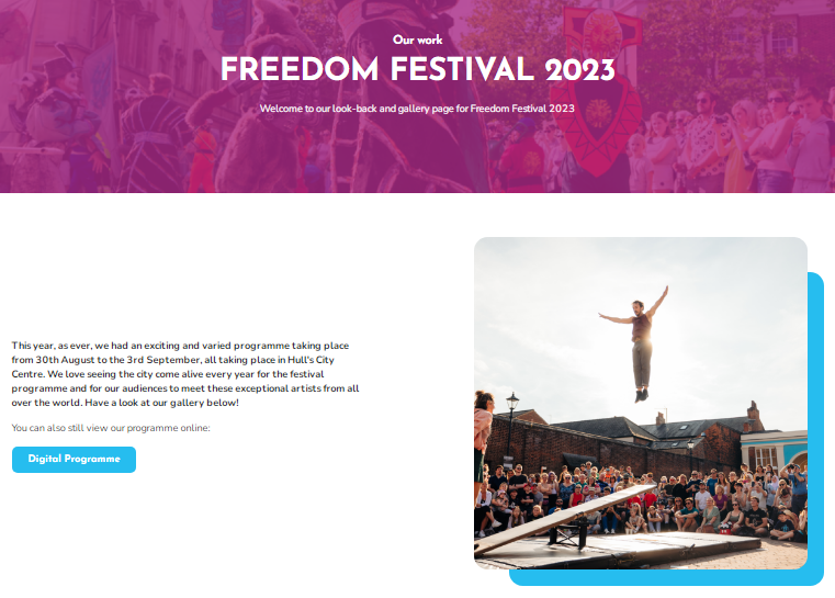
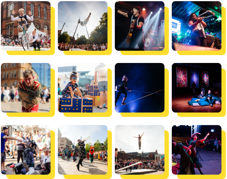
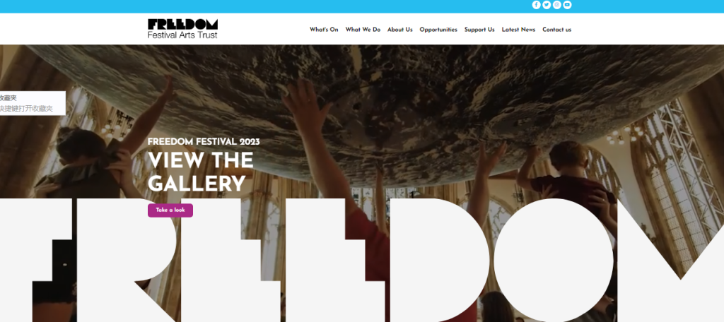
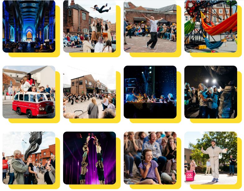
In 2023, its design, I think the activity web page is still more creative, like a magazine, spread out erery page,just like the life, We like to see the city.Every year, the festival is brought to life by the program, and the audience can also meet people from Outstanding artists from around the world. Its design is like an activity, free, open, enthusiastic, peaceful, different music performance, art performance, action performance, the disadvantage is that the evening activity design is a little lacking, and there is no particularly creative, fresh, recent popular activities. I will re-create the website and plan an activity that is fresh, interesting, nostalgic and futuristic.
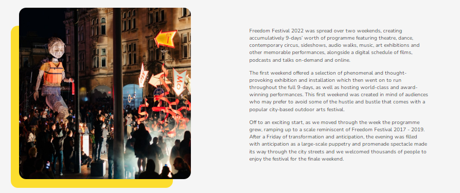
The 2022 Freedom Festival presentation
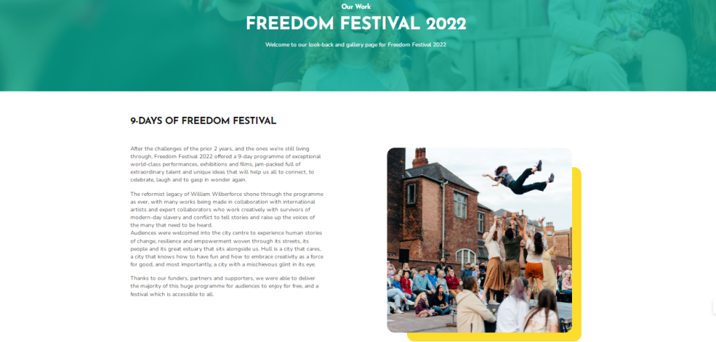
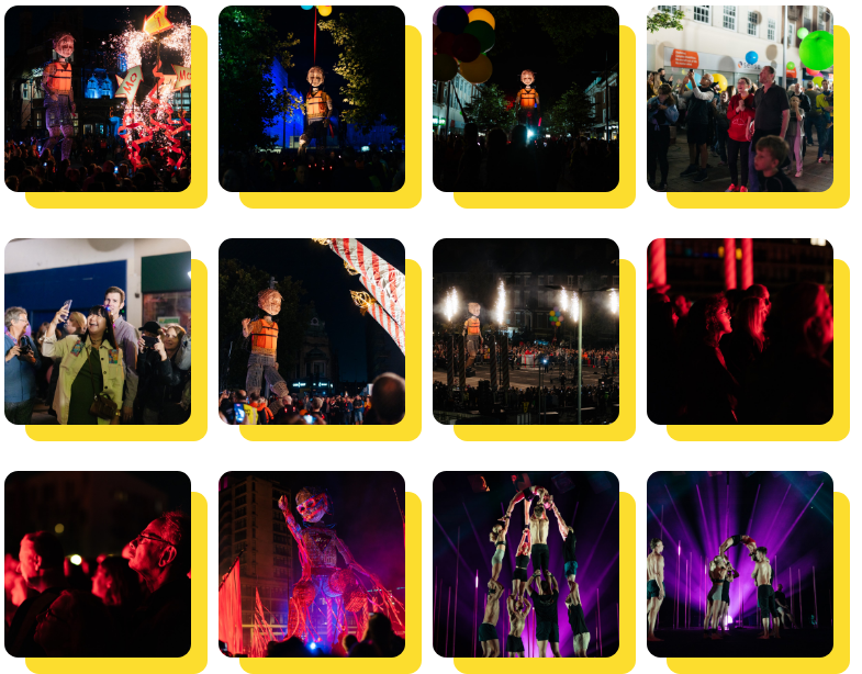
In 2022, its design is very good, everyone likes it, cycling, roller skating, human body art, very diversified, the trust fund activities in the evening are also very good, it is a very rare free festival, but its disadvantage is that there is not much sense of technology, there are impressive peripheral products, there is no good memory, I will redesign the freedom festival from this aspect.
Design
Logo and Brand

After several years of design, I think the brand and logo of Freedom Festival have not changed much. Basically, they are the superposition of layers and the filling of letters like blocks. There is a lack of innovation in design.
Website layout
Mobile phone version
The mobile version of the free section, the layout is relatively simple and easy to operate, but the menu button is very inconsistent with the layout, when clicked, you can’t see the content of the page, and there is no interaction with the user, the interaction is too weak, the layout video click will affect the opening speed, or even can not open, and there is no big data technology to push the content of interest to Lenovo users, as well as the message board area
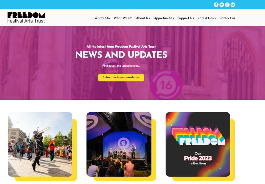
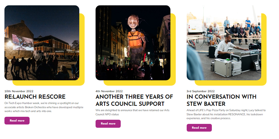
Web version
The layout of the web version, it has many unused functions, is not in line with the simple style habits of young people, the home page display content is monotonous, not easy to attract, the Hull activities over the years, in the back of the layout, for the first time browsing people, it is difficult to stay, even can not find, the video content is too little, the interactive layout is too little, you can distinguish the interactive layout according to age, You can also launch a vote according to your hobbies, and you can also collect activity cases, so that the buzz of Hull Festival offline can also be continued online