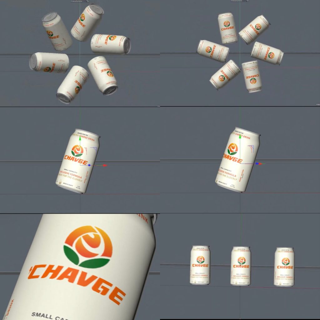
This is what I created my storyboard, the first panel is to rotate in the form of a sunflower, each rotating all-around display design so that it seems more active and interesting then the next is a close-up to the close-up shots, in a classic slow rotation so that the audience can better see the details and the text of the slogan, because some people may not be able to see what is written on the bottle, so close-up rotation, then you can better observe the design of the drinks Details.This is the interactive animation effect I use, providing a 3D view from multiple angles, and then it can also increase the display effect of the product and the confidence of the purchase, and finally invert the three bottles in the middle to see the whole from a distance, at first I didn’t have the first picture is rotating in the form of a sunflower, and then I felt a little too bland at the time, maybe not as happy and energetic as the energy drink brings people.And the name of this logo, the v should be r, I didn’t notice it when I designed it, but I changed it in the last video.